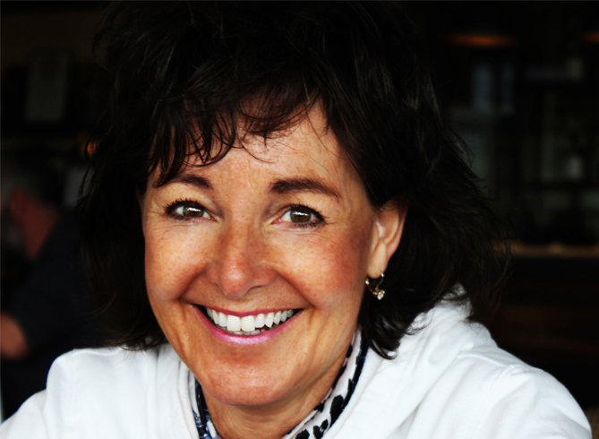
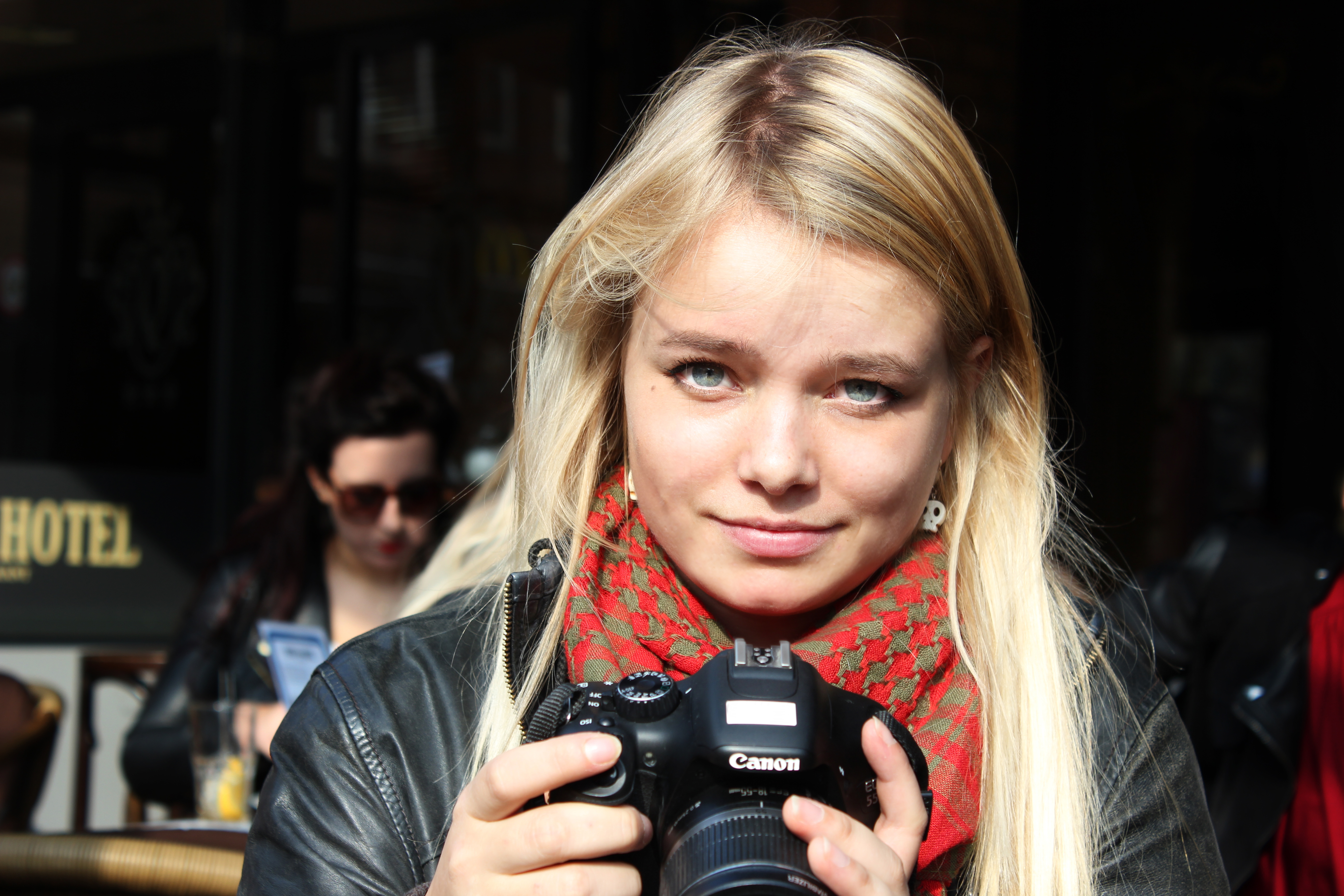
My name is Sophie


I like coffee and cheese.
Oh, and I make stuff.

sophie
  • Creativity

    You can it find anywhere. Especially in your own brain.

  • Development

    Thank God that I followed that typingcourse when I was 10.

  • Photography

    Visuals to forget reality for a few seconds.

About--Sophie van Duivenboden--Student--Designer--Developer--Photographer--

Hi, my name is Sophie van Duivenboden. Currently, I am a IT and Media Design student at Fontys University of Applied Sciences in Eindhoven (the Netherlands).

Since I was a little girl, I've always been very interested in very small details. This was, at that age, a very distracting thing for me. But now, as a designer, photographer and developer it is one of my best skills. During these studies I realized that this detail skill thing can always get better and better: I see a lot more details now than 2 years ago.
Personally, I like dark design. I know, it does not really show on my portfolio website. The reason is that I am absolutely not a dark person. Maybe just a little bossy. And hungry all the time. And I like moving visual things, and I like working on that. I love animating things. Think about nice effects on websites, developing games, etc.
The reason that I chose design and programming together, is that I am very easily distracted. Programming is one of the few things that I can really focus on.
The bad thing about that is that after a while I get a headache. Then, the designer in me wakes up! Open minded, details, research, concepts... A completely different mindset for the more visual, creative side of me.

Interesting? Or you don't get it? You can always contact me if you have any questions about me.
You can also just randomly contact me if you feel like chatting. I really like chatting.

SkillsAlways in progress

    Programming

  • HTML 5
  • CSS 3
  • Javascript
  • Construct
  • jQuery
  • PHP
  • SQL
  • Adobe

  • Adobe Photoshop
  • Adobe Illustrator
  • Adobe InDesign
  • Adobe Premiere Pro
  • Office

  • Office Word
  • Office Excel
  • Office Powerpoint

PortfolioHere some of my latest work. It includes photograpy, design and development.

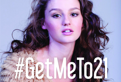
Get me to 21

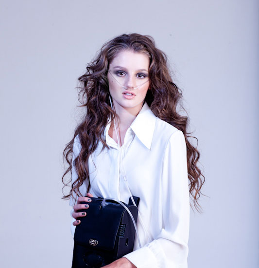
The campaign is about a girl named Jenna Lowe. Jenna is a bright, beautiful and extraordinary 19-year old girl living in Cape Town, South Africa.
Early 2012 was Jenna (then age 17) diagnosed with an extremely rare lung disease called Pulmonary Arterial Hypertension: the veins in her longs are cropping and dying. The majority treatments for this disease is not available in South Africa, which means there is only one solution: to get two new lungs.
‘Get me to 21’ is a viral campaign where Jenna invited all South Africans to join her at her 21st birthday party at 28 October next year- if she makes it. Without a lung transplant, she may not be alive to celebrate her 21st birthday. The only thing that you have to do to help her and 4300 other people and to be able to go to her party, is subscribe to be an organ donor.

Click here to see the new way of subscribing to be an Organ Donor!

A lot of research on the website of Jenna Lowe (http://jennalowe.org/) was needed to create the design, as well as using the video as a resource. It needed to feel girly and cute, not scary at all while also realizing that the form had to be low effort for the user.
One month after the release of the campaign over 7000 people subscribed. This means it was the biggest campaign for Organ Donor Foundation ever (the biggest one before was 5000 subscriptions in one month). The number is still rising! The campaign has been Ad of the Week at marklives.com. Here’s the link: http://www.marklives.com/2014/10/ad-week-getmeto21-fighting-apathy-empathy/.


Organ Donor Foundation: Get me to 21.

A campaign for a girl named Jenna. She invites you and your friends to her 21st Birthday party. But to make it to 21 she needs new longs.
All you have to do to get an invitation for her party, is to subscribe as an Organ Donor.

Font Geeks

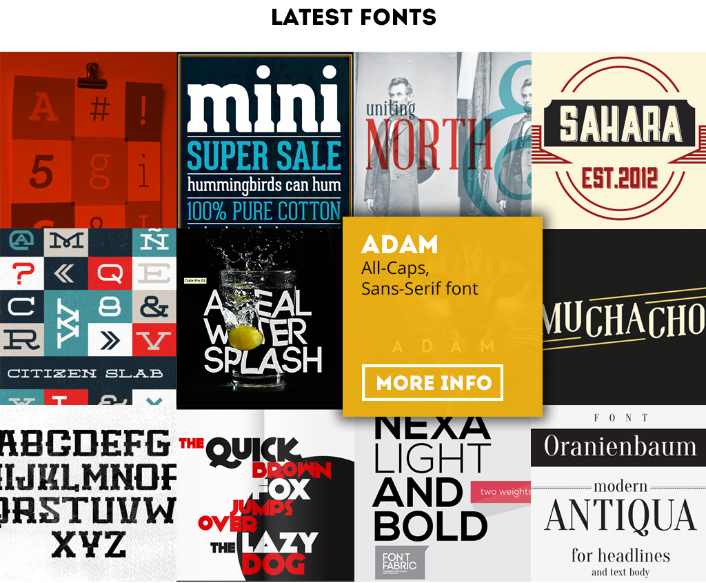
Font-geeks is made by me and 3 other students, based on a CMS template of Wordpress. This was the first time that we've been working in a CMS system.
I was amazed of all the possibilities! Everything had to be SEO proof (findable in Google), fast and quick. The website is made for designers: find a font that you like and know everything about the copyrights without searching your ass of! You can even download the fonts right away!

Click here to go to the live website!

My job was creating content and working on the back-end for the CMS system. All the images are pictures we took ourselves, so we don't have to deal with the copyrights.

The website has been such a success that we are still working on it, and we hope that it can stay live for another while!


Font Geeks

A website made by me and 3 other students from my University (Fontys University of Applied Science). The website is to help designers to find beautiful fonts without struggling to find information about the copyrights. The website is based on a Wordpress template.

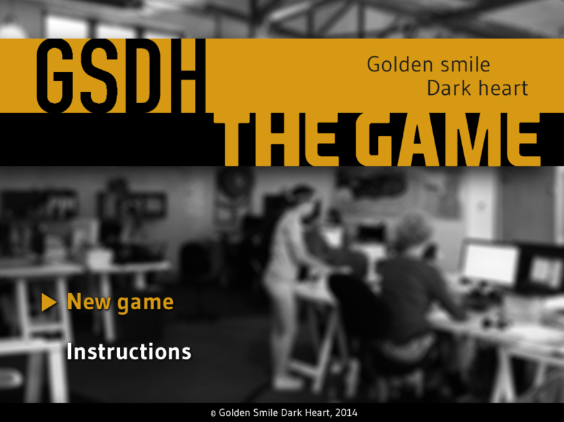
The GSDH Game

GSDH wants to make such a good impression that there is no way that the client will say no to their services. My main assignment was to provide them with a solution. The game should provide value to the company GSDH and also have the right, appropriate look that will fit the company. A game seemed to be the perfect solution.
So the final concept: A game that gives potential new clients a fun experience to learn about the company GSDH, the employers and the way of working.

Click here to see the result of the game!

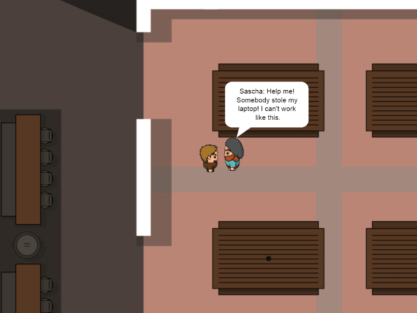
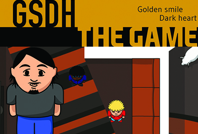
The game is made in the programme Construct 2, a programme to create HTML5 2D games. All the sprites and images are created by myself in Illustrator. The playfield is the real workfloor, and all the furniture is accurate to the real building. All the characters in the game are real people that work at GSDH and the problems they are dealing with are real problems that they had when I was working there.


GSDH: The Game

A game about the agency GSDH (where I did my internship). The player has to find the productionteam in the right order. All of them lost something, and the player has to find the sollution for them. This way, the player get's to know the agency and their workflow.

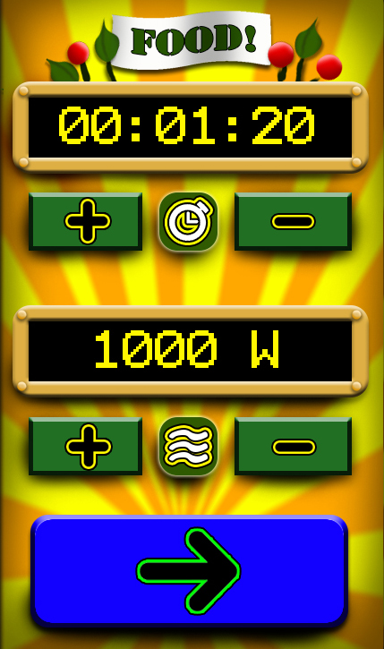
The Microwave App

The course was named Audio and Visual Prototyping. The information we got was to create a fun application to control your microwave. Seems a little bit boring, right? That's why I decided to create an application similar to a Las Vegas Fruit Machine! Fun to play, your food must taste amazing!

All the visuals are handmade in Photoshop. We also had to do paper prototyping and explain why an application like this.

Experience the microwave app here!

The app is made in HTML5, CSS, Javascript and PHP.

Microwave app: Game your Microwave Food

A prototype of an application to control your microwave. Very easy to use, and a fun way to heat your food. This is a prototype I created for my university (Fontys University of Applied Science) for the course Audio and Visual Prototyping.

Games4Therapy

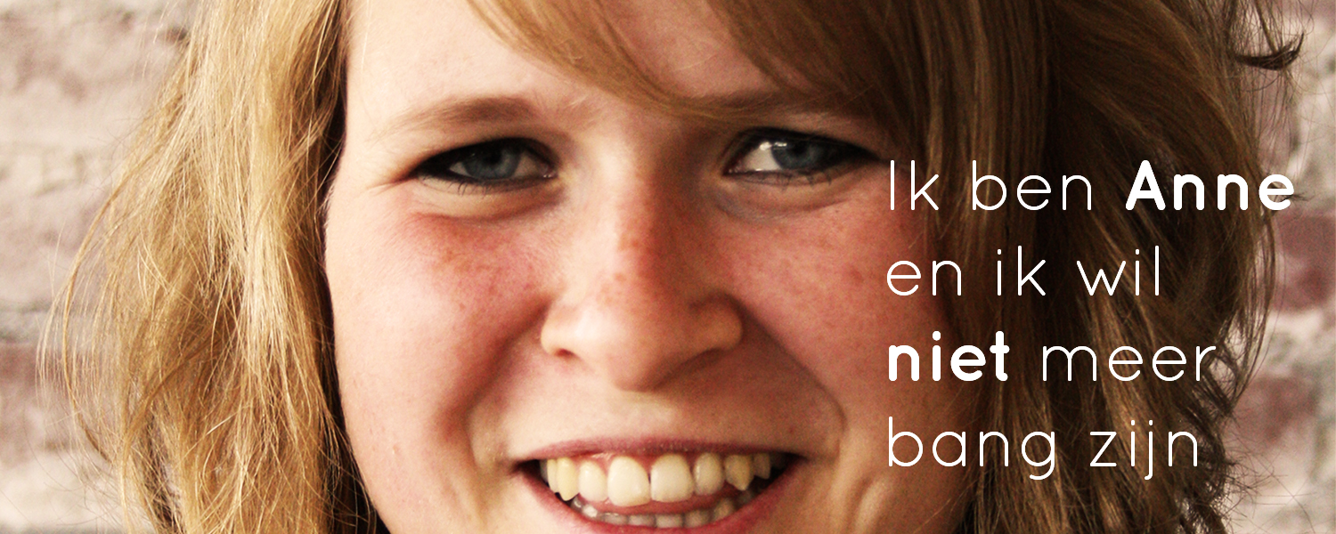
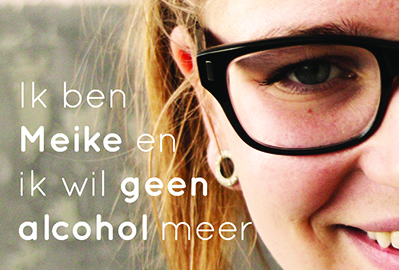
Games 4 Therapy is the result of 6 months of hard work. It was not just 'create a website', but it took us a lot of research to come up with a great concept for this. The idea was to create something that gives information about eHealth apps for mental health. Think about people that struggle with cigarettes, alcohol or drugs, or even people that are authistic or had ADHD.
The problem was: how do you communicate with people that actually don't want to communicate? They have enough problems already, why waste their time with applications?
After a whole bunch of interviews and research, we came up with this: Games 4 Therapy. The idea behind it is that we don't want to put people in blocks, but give them goals. Like: I want to quit smoking, or I want to live healthier. This way, it doesn't look like they have problems, we just want to help them to feel a little better.
Please click here to see the result!

I created the whole backend behind the website and did all the PHP work. This was the first project for me that I really worked with a lot of databases, also because of the admin system. The user can manually add more apps in the right category. I also took the pictures and did a lot of design work.
The website contains HTML, CSS, JavaScript and PHP. I think this is the project that I'm the most proud of from my second year. It was for the course Digital Publishing.


Games 4 Therapy

This is a website that gives information about phone applications that can support mental health. The concept is: don't put people in a box! Just show goals. In that way, maybe even teenagers are interested in the website.
This is a website made for Fontys University of Applied Science, for the course Digital Publishing.

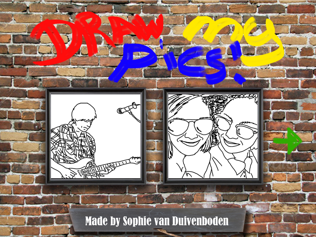
Draw my Pics iPad Widget

This is a widget that I created for the course Digital Publishing: Content Creation. It is a widget created for an iBook (iPad).
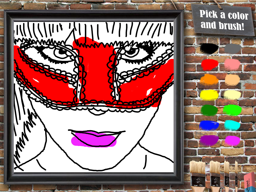
We had to create an iBook with information about your own life history. I chose this, because I really like photography and drawing. The widget is a mix between both of that: the lines in every drawing are based on pictures that I took. If you click on a picture you can color them in.

Click here to experience my passion!

Unfortunately,I was not able to get it working on iPad. But I really like the idea and the concept behind the application and it works great on the desktop/laptop, so that's why I decided to put it in my showcase anyway.
It's made with HTML, CSS and Javascript.


Draw My Pics!

Choose the image you like, and color it in the way you like! The lines for the images are based in pictures I made myself. This application shows several things that I really like (drawing and photography).
This application is made for Fontys University of Applied Science, for the course Digital Publising: Creating Content.

Van Duivenboden Office Management

Because of the 10th year anniversary of my mums business 'Van Duivenboden Office Management' and because I wanted some more work in my portfolio, I offered to create a brand new website for her. I sat with her and talked about what she wanted, what I thought was good for her website and what should be completely different on the website. I did a lot of research and realized it was pretty difficult to find some good-looking website examples for Office Management. Now it's finished, and her and I are very happy with the result!

Click here and check it out!

To create this website I did a lot of re-branding: the first website was very old, the same age as the company exists. It is build with HTML(5), CSS(3), PHP and is completely responsive for every device.


Van Duivenboden Office Management

A website for my mums business 'Van Duivenboden Office Management'. Her company excists 10 years, and so did her website. On the 1st of April 2015 it was time to put the website online!

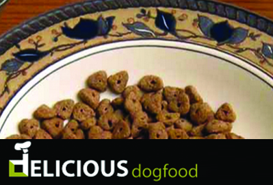
Delicious Dogfood

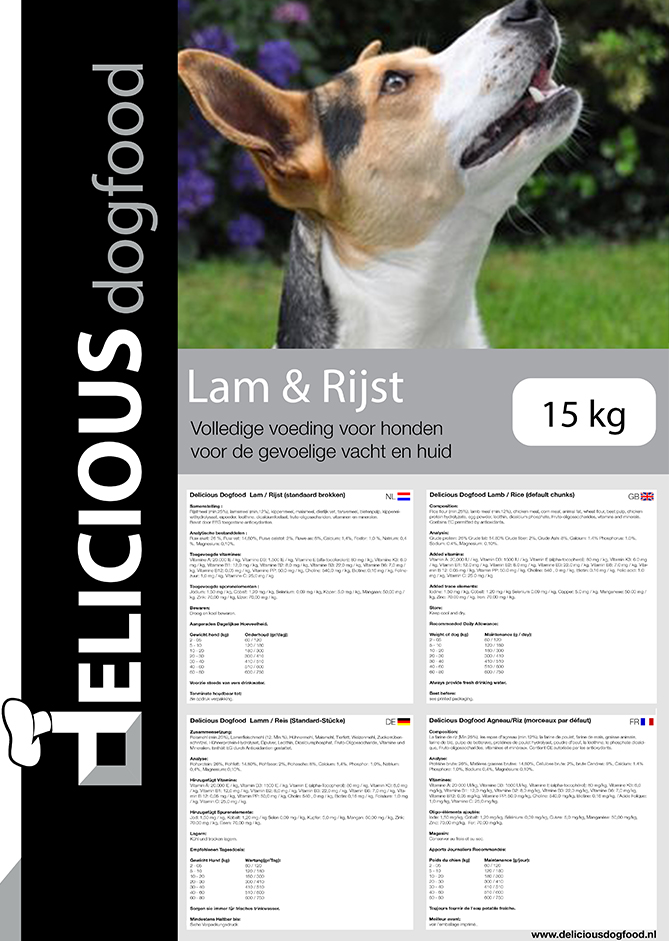
The owner of Delicious Dogfood started the company in 2014 with just the name: Delicious Dogfood. He needed everything else: a logo, design and development for the website, content for the website, designs for the dogfoodbags... everything.
After many meetings we got to the result.

Here is the website (show it to your dog too!)

For this website I could use some of my knowledge that I had from my first studies as veterinarian surgery assistant
. I wrote the articles about dogs and how to take care of them, HTML, CSS and Javascript. I also designed the dogfoodbags.


Delicious Dogfood

Looking for something tasty AND healthy for your dog? Then you should go visit this website! Delicious Dogfood sells the best quality in dogfood, and you can see that on their website. I did the branding and the design of the logo and website, development of the website and creating content.

Feel free to contact meI will reply as soon as I can. As I told you: I love to chat!

Thank you for contact us.

* These fields are required